#8 Applications: Tracking canal flows with Remote Sensing

Canal networks discharge water from dams via main canals, distributaries, laterals and field channels to fields periodically throughout the agricultural season. In India, in many cases these canals are not monitored by automated means, instead data on discharges at various points on the canal network is collected manually. In some cases, the government shares this data openly. In most cases, not.
If it were available however, this data could be powerful in informing decisions in the agricultural supply chain. Timings of canal flows could be linked with fields that benefit from the water to predict the stages of the crop season. Timely and real time knowledge of the stages of the crop season in each village could empower every entity in the supply chain to optimize its operations.
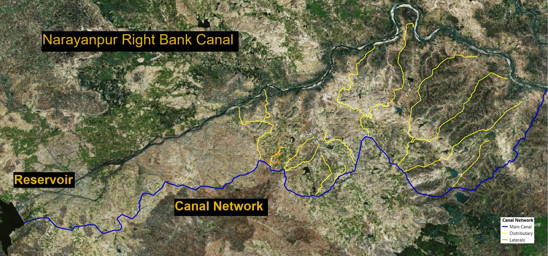
The image below shows a map of the canal network of the Narayanpur Right Bank Canal (NRBC) in northern Karnataka, India. Like arteries its network gets thinner as it moves away from the main reservoir , to serve areas downstream.
Fig 1 : map of Narayanpur Right Bank Canal Network, Karnataka, India
Current openly accessible imagery from earth observing satellites can be used to visualize the flows of water in the canal at different temporal frequencies (weekly and monthly) and spatial resolutions (10m,5m). The blue streak in the gif below clearly shows flows within the main canal during certain months of the year and not others.
Fig 2 : gif of flows at canal head, with hi-res (5m) monthly imagery
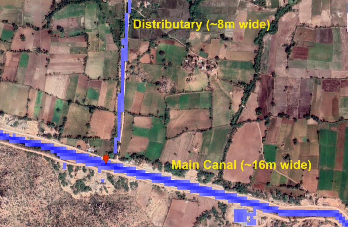
Its easier to visually observe flows in the main canal as compared to the distributaries, where the presence or absence of flows can be ambiguous due to the decreasing width, from typically 16-20m wide to 8-10m wide.
Fig 3 : Image showing canal widths at main canal vs distributary with med-res (10m) weekly imagery
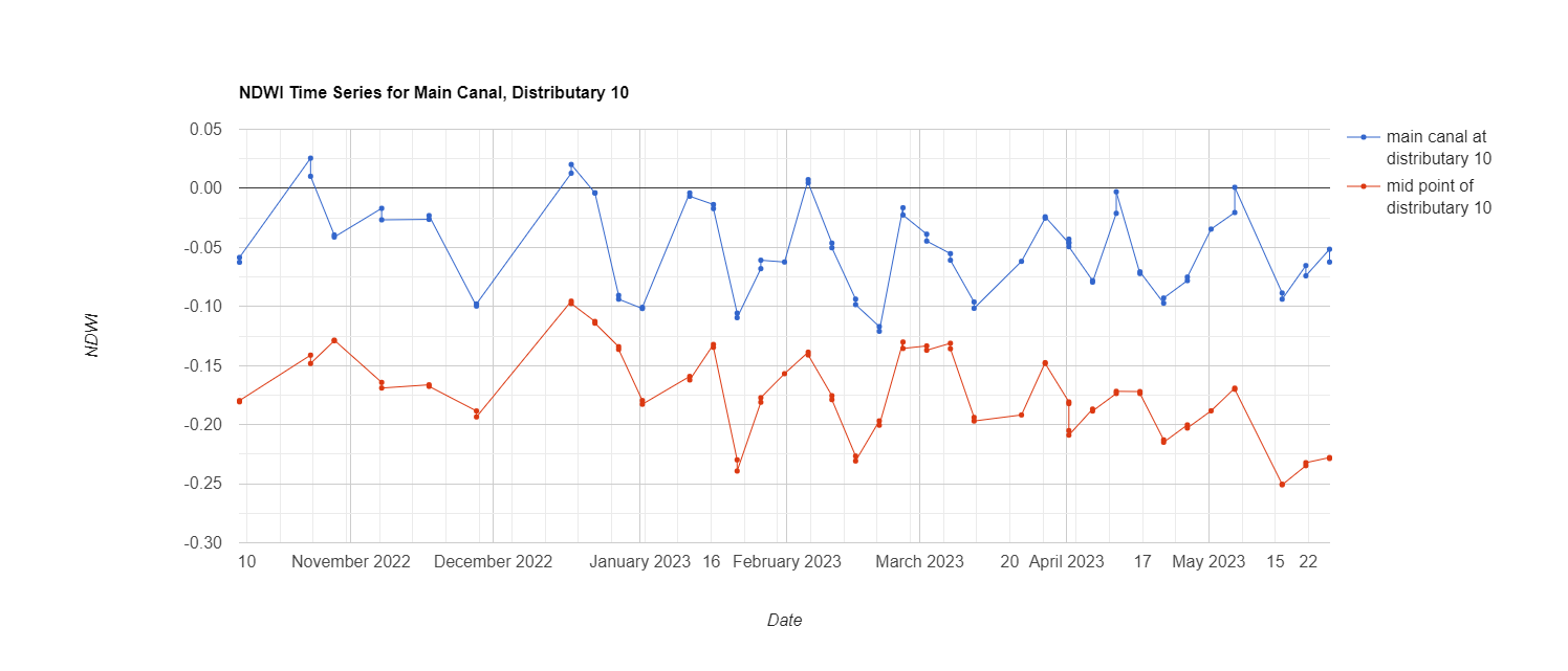
However a cursory glance at an NDWI (Normalized Difference Water Index) chart, clearly shows oscillating patterns of increasing and decreasing flows of water. The blue line in the chart below represents the flows in the main canal, for which the signal is observed to be greater in magnitude. The orange line represents flows at the midpoint of a distributary. While the magnitude of the signal observed is smaller than the one from the main canal, the pattern oscillates neatly in lockstep with the pattern of the main canal. They are strongest during the months of October to March, in support of the winter (Rabi) crop and minimal after that.
Fig 3a (image showing chart with NDWI with sentinel on one chart at three different locations, main canal, distributary and lateral) the time lag should be visible.
Look out for Part 2 where we use ML to examine the relation between canal discharges and cropping patterns.
As always for the code used to produce these posts, do check out my Github